If you wondered what I was going to say this month about our market, I am right there with you. I spent a lot of time trying to figure out what has been happening, and offer a guess at where we are going. This month the picture is not clear.
For about a year now, we have seen sales decline, inventories increase, and prices rise. All this while some of the reporters and forecasters have been saying things were good. Most now have come around to acknowledge that things have slowed down. We are finally in sync. Or are we? The figures are a little confusing, the graphs downright head-scratchers.
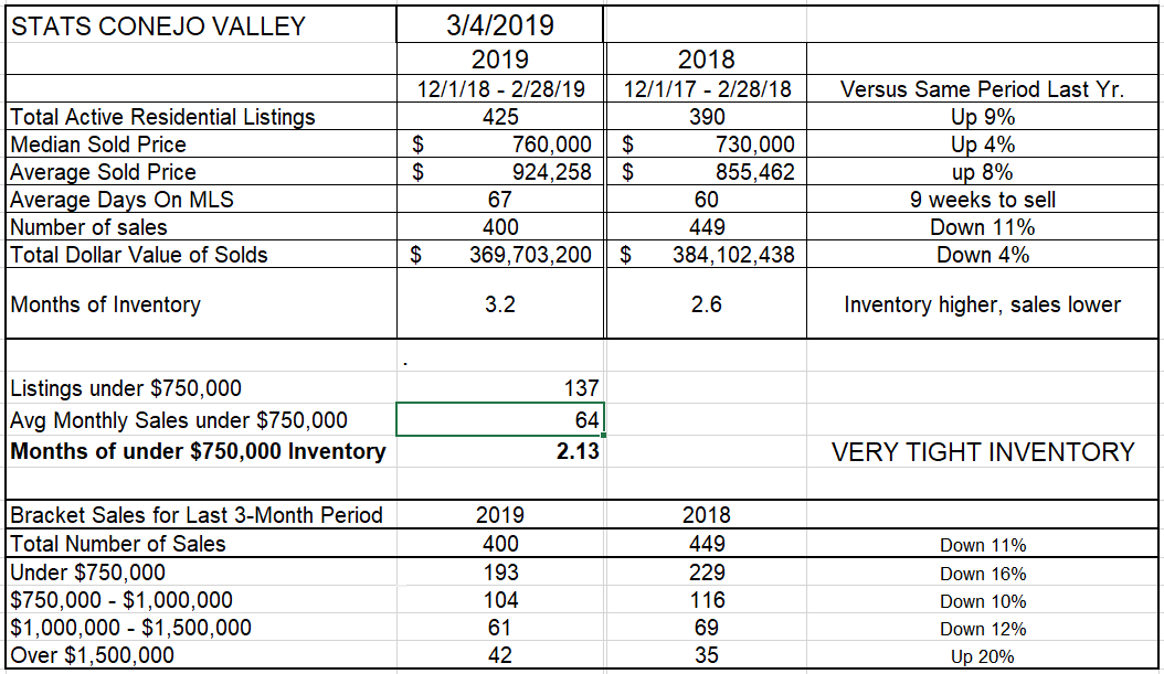
Let’s look at the numbers first. The Conejo valley has consistently been experiencing inventory increases (compared to the same day a year ago) of 20%. Now inventories are only up 9%. Sales have been down 20%, now down 11%. Prices have been weak or stable, and this month (comparing a 3-month period this year to the same 3-month period last year) shows a major increase. Can all this turn around in one month? I use a 3-month range so that one strong or weak month cannot change the data significantly. And although the numbers are smaller and therefore easily influenced, sales in the over-$1.5 million category continue to increase dramatically. What this says to me is that the market is balancing and adjusting, making it hard to tell where it is going. More than likely it is settling in at a lower level, but these numbers are confusingly aggressive. First head scratch.
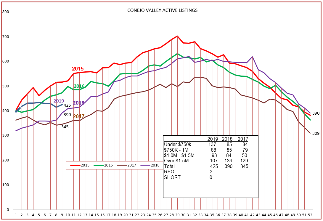
 Let’s compare the graphs to see if they coincide with the numbers above. We will begin with inventory. The first half of 2018 was a normal year, with numbers rising into the summer. The real increase in inventory took place at the end of summer, spiking and adding to the inventory available for sale. To start off this year, the graph line is flat, with inventory not climbing as expected at this time of the year. Second head scratch.
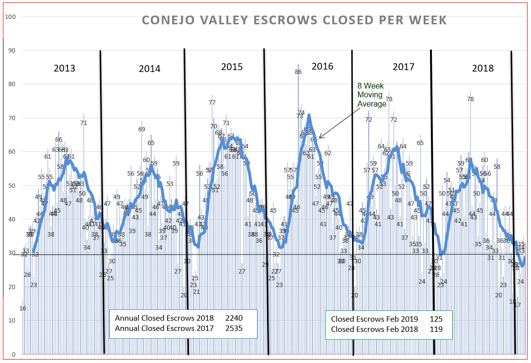
Is that inventory stable because not many people are putting their homes on the market, or is it stable because a higher number of homes than usual actually sold. Last year was not a good sales year, with the peak in sales comparing to 2014, not a memorable year. The area under the graph represents the total number of home sales. One box in the graph shows that we sold 295 fewer homes in 2018 versus 2017, a significant 12% drop. The trend in sales closed dipped below the horizontal line of 30 homes per week before finally experiencing the beginning of the year increase. And as you can see from the other box in the graph, February sales were actually a little higher this year than last.
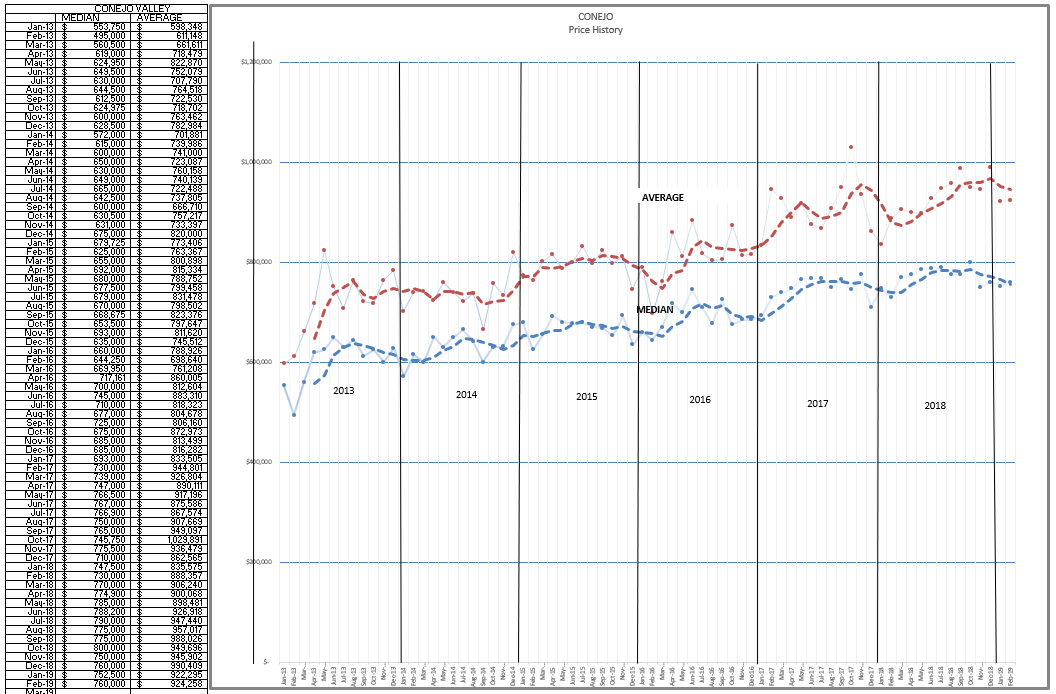
And finally, the third leg of the three-legged supply/demand discussion, how are prices trending? They are trending lower, as is usual for the end of one year and beginning of the next. These numbers are for the individual month, not a 3-month average. The dotted line does the averaging for us, allowing us to see the trends with a smoother line. This graph does not indicate prices are going higher, as the statistics chart initially showed. The separation between the two lines has been growing, indicating a higher percentage of higher-priced homes in the mix. Comparing prices to a year ago, there is a significant increase, but mainly because of the large dip in prices at the beginning of 2018. According to the graph, the large increase in prices in the chart is an anomaly, and prices are actually on the decline. You can make the number say what you want them to say by picking the time periods you are comparing. The trick is not to make them say what you want, but to listen to what they are telling you.
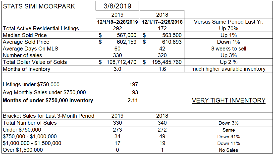
For Simi Valley/Moorpark, the story is similar. Inventory has grown considerably since last year, but inventory growth has been slowing. Previously inventory was more than double the same date last year, now it is only 70% higher. Still a huge percentage number, but the inventory in Simi/Moorpark had been anemic, and there was plenty of room to grow. Sales in previous reports were down 15-20%, and are now actually up 3%. And prices remain about the same, no growth from last year, but a huge difference from the Conejo numbers. The below-$750,000 category is doing well compared to last year, higher priced sales are not.
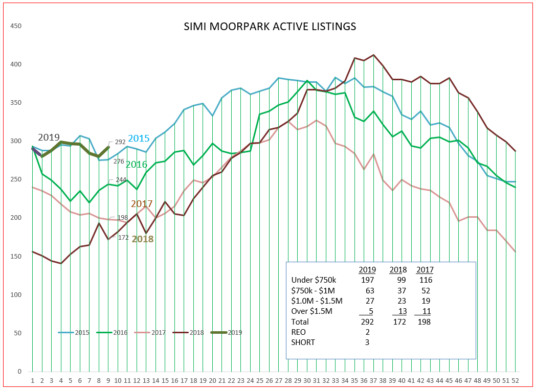
 For Simi Valley/Moorpark, the inventory began the year extremely low, and inventory growth at the end of 2018 was even more pronounced. This year we are starting off with inventory going sideways. For Simi Valley/Moorpark, that appears to be normal, with 5 of the last 6 years starting off with either stable or declining inventory, very different from Conejo. 2018 started out with extremely low inventory levels, and continued to grow strongly through the summer season and after, finally replacing the extremely low inventory with one more normal.
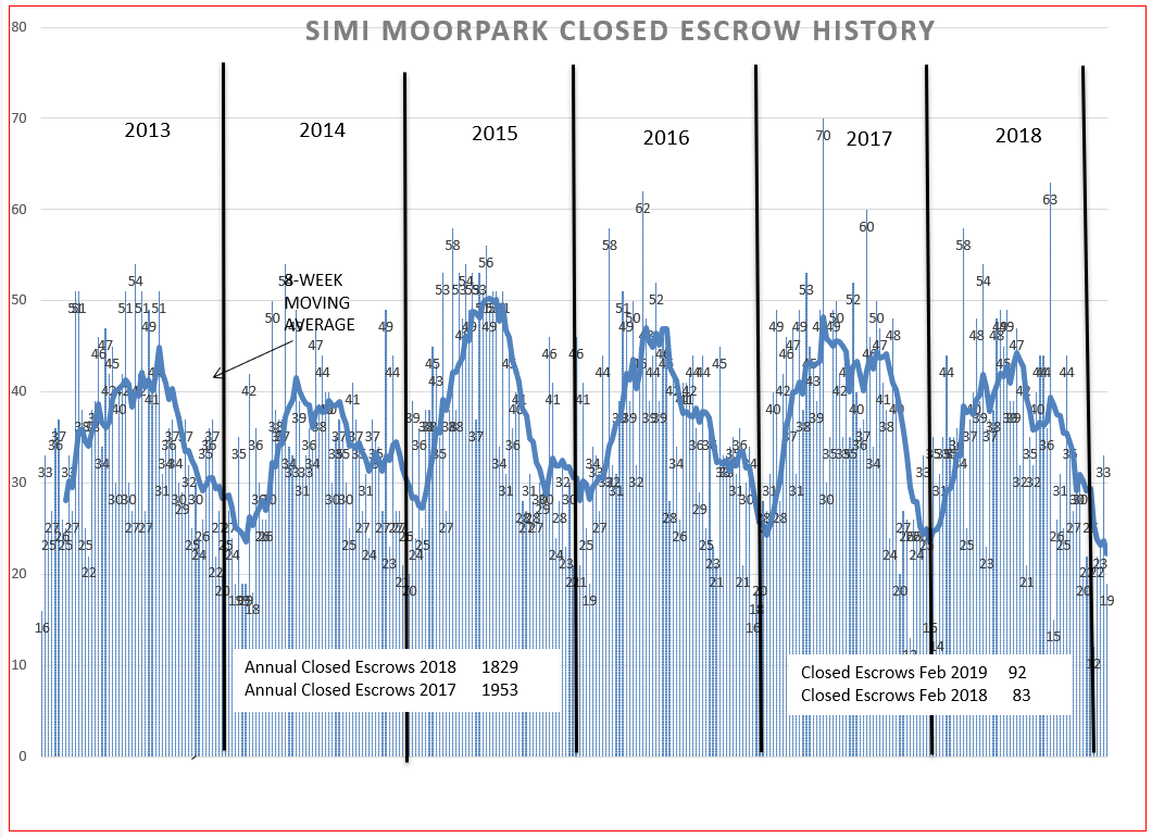
Last year was not a good sales year, the lowest in the last four years. The area under the graph represents the total number of home sales. One box in the graph shows that we sold 124 fewer homes in 2018 versus 2017, a 6% drop. The trend in sales closed is approaching the horizontal line of 20 homes per week and has not yet experienced the beginning of the year increase. And as you can see from the other box in the graph, sales were actually a little higher this February than last.
Finally, prices in Simi/Moorpark have been declining for six months. The chart did not show the temporary rise that we saw in the Conejo information, and neither does the graph.

As they say on the Sunday morning political shows, what can we say to sort out the spin?
The market started out this year with higher inventory and lower sales, and continues in that vein. Prices are stable. Given the overall business climate in Ventura County, inventories will continue to be at reasonable levels, sales at levels lower than last year, and prices are moderate. No rain in the forecast, no lightning or thunder, and the market will be partly sunny or partly cloudy depending on your outlook.
Have a prosperous month.
Chuck