The Fed wants things to slow down. Things are slowing down.
Many want to know how this compares to 2008?
CAR has two absolutely excellent economists, Jordan Levine and Oscar Wei. I am going to borrow three of their recent slides to show you the difference between now and what we have called The Great Recession.
First, a look at Negative Equity by state. Why were there so many foreclosures in 2008? One reason was a lack of equity. That made it easier for homeowners to walk away from their homes. During The Great Recession, a negative equity position was experienced by 30% of all homeowners, resulting in foreclosures and REOs becoming the major market factor.
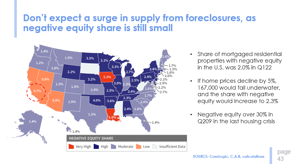
Today, California homeowners with no equity in their homes represent less than 1% of all California homeowners. While we don’t expect a major drop in prices, a correction of perhaps 5% is probably reasonable. That drop would raise the negative equity figure to 2.3%. Versus 30% in 2008. Homeowners today have a lot of “skin in the game”.
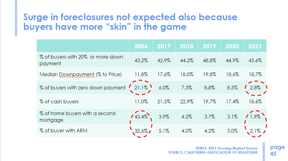
One of the reasons is because mortgage lenders have been much more conservative in lending than in 2006. Buyers with zero down payment represented only 2.8% of all buyers in 2021, versus 21.1% in 2006. Today, less than 2% of homeowners have more than one mortgage, as compared to over 43% in 2006.
In 2006, a third of all mortgages were adjustable, whereas 98% of today’s mortgages are for fixed rates, many at historically low fixed rates.
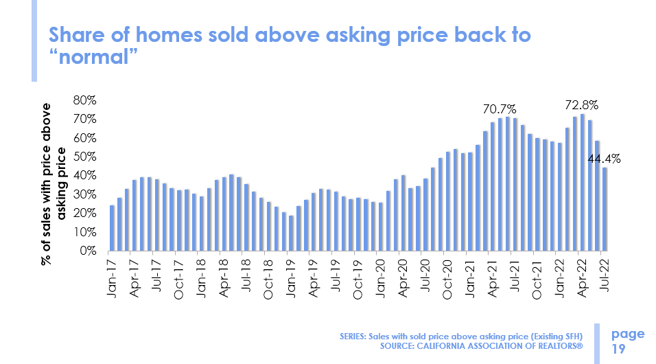
My final slide from Jordan and Oscar is a graph of what percentage of sales are occurring above the asking price. Going back six years, pre-pandemic, the average was around 30%. During the pandemic, we were up around 70%, but have recently dropped significantly to 44%. Yes, things are slowing down.
This information dates back to 2017. You can see that discounting is more prevalent in the winter months, with less discounting more prevalent in the busy summer months. The past two pandemic years have seen overbidding become the norm, but recent figures show overbids are coming down to their historical averages.
Thank you, Jordan and Oscar, for this information. These pictures allow us to see what is going on today. A slowdown, but not a panic stop. Prices will moderate slightly, but no balloon bursting.
Now lets go local.
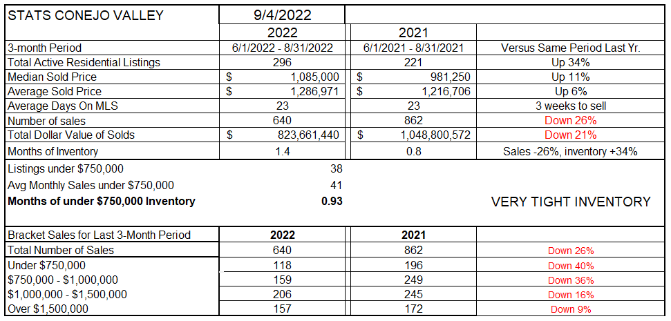
Has our inventory grown? Yes, but by how much depends on the yardstick you are using. The table below compares prices from this year to last year, with most of the comparisons representing a span of three months. Conejo inventory is up 34% while sales are down 26%. Price increases still show 6% to 11% increases from last year, comparing the last three months this year to the same three months last year. The number of sales are now lower in every pricing segment of the market, as shown in the bottom of this table. I suggest you don’t use this comparison to discuss prices unless you want to explain to the homeowners how much their home value has increased year over year. To get a look at how prices are reacting today, we will shortly look at a different chart. (A different yardstick)
Inventory and sales are tied together in the “Months of Inventory” number. As inventory grows and/or sales decline, our current inventory now takes almost twice as long to sell as it did last year. In past years, we have considered three months of inventory as usual, as a normal market. We are heading in that direction. Normal.
Let’s look at Conejo pricing in the graph below. These prices are monthly averages, not three-month averages. Prices are beginning to show a drop-off, both median and average.
As the Fed tightens by raising their borrowing rates, other rates will follow, including mortgage rates. Another Fed increase is expected this month. Additionally, the Fed had previously been a buyer of mortgage backed securities. Now the Fed is no longer in that market. The extra support from the Fed buying mortgage backed securities is no longer a factor. Demand is lower, causing rates to rise. For the short run, this will cause mortgage prices to rise.
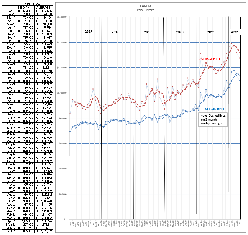
The graph above shows prices declining, particularly Average prices. This dos not seem apparent in the Simi/Moorpark pricing charts below. To understand why, I looked more closely at the top-level slice of house prices, homes above $1.5 million, as perhaps the reason for the Average Price overall decline.
For the last three months of 2022, 157 homes closed escrow above $1.5 million, with an average price of $2,307,921
For the same three months of 2021, 172 homes closed escrow above $1.5 million, with an average price of $2,473,460.
The average price of homes sold above $1.5 million was $165,000 lower in 2022 than in 2021. This does not mean that these individual homes experienced a drop in value. Individual homes still sold at increased prices versus a year earlier. However, there were fewer really high-priced homes in the mix. That mix factor brought down the average price for all homes. Rather than an actual price dip, it is a dip highly influenced by the comparative lack of uber-priced homes in the mix.
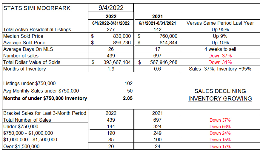
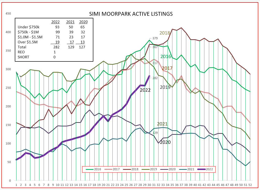
Simi Valley/Moorpark is mostly similar. Inventory is up a higher percentage, up 95%, while sales are down more than Conejo, down 37%. Prices are up 9-10%, but again that is over a three month period. Months of inventory has tripled, from almost half a month last year to nearly two months worth of current sales. Similar to Conejo, sales numbers decreased across the board, as seen in the bottom of the table.
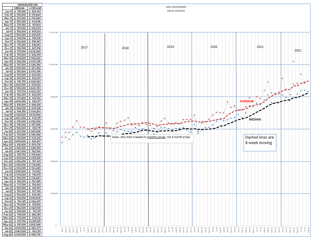
In the Simi/Moorpark pricing chart below, we have not seen the drop-off evident in the Conejo chart. Simi/Moorpark has been experiencing a lack of inventory for a lot longer than Conejo, and the rate of price increase has a longer history. Expect that to pause rather than drop.
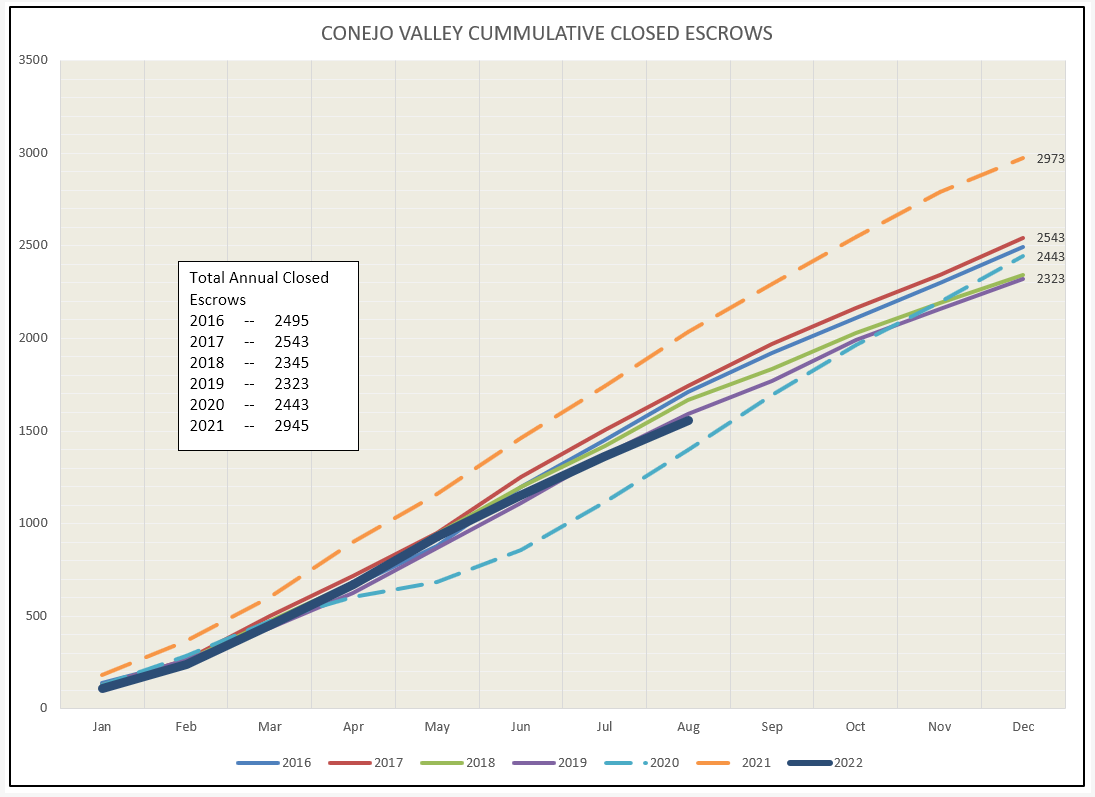
Let’s next look at inventory, to see how it is behaving compared to how we expect inventory to behave as we travel through the year. (Starting out slow, increasing as we go through summer, declining as we approach year end.) In the Conejo, the inventory graph is following along the expected path as the year progresses, if we forget about 2020 and 2021. 2022 is starting to look like a normal curve, albeit at a lower total level of inventory.
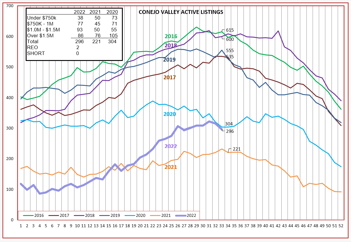
For Simi Valley/Moorpark, inventory growth is much stronger, with no expected decrease apparent as of yet. Inventory growth is up 95% versus 34% for Conejo. This should begin to have an influence on prices. Remember, prices reported are 60 days later than what is happening with contracts today. Notice that for both Conejo and Simi/Moorprk, REOs and Short Sales are basically non-existent.
Lastly, let’s look at how sales have been doing. The dashed lines represent 2020 and 2021, and are dashed because those years were anomalies. They were excellent anomalies, but they certainly were not normal. The orange line below is more what we would expect as the year goes forward, and 2022 is showing weakness.
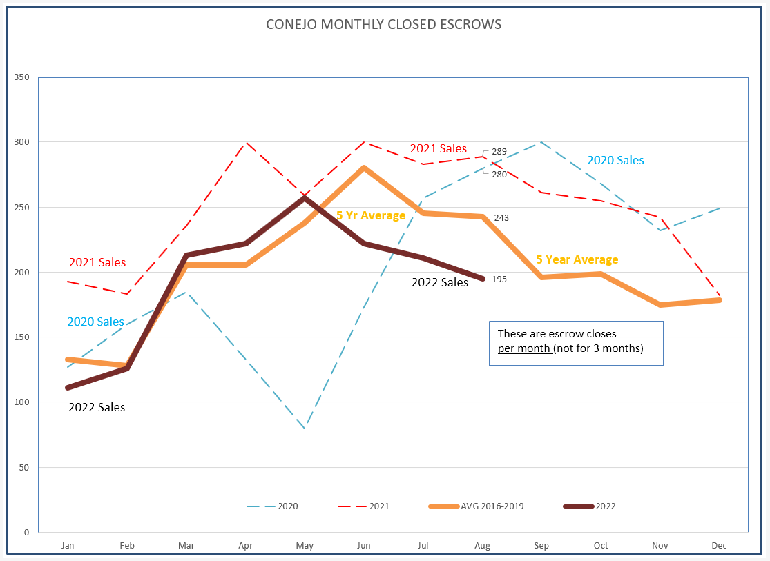
The graph below tracks the same numbers but shows the growth in the total number of sales as the year progresses. It is beginning to fade.
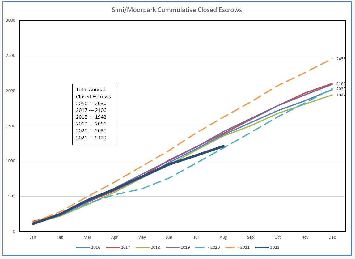
For Simi/Moopark, much the same look. Sales are much weaker then the average (orange) line.
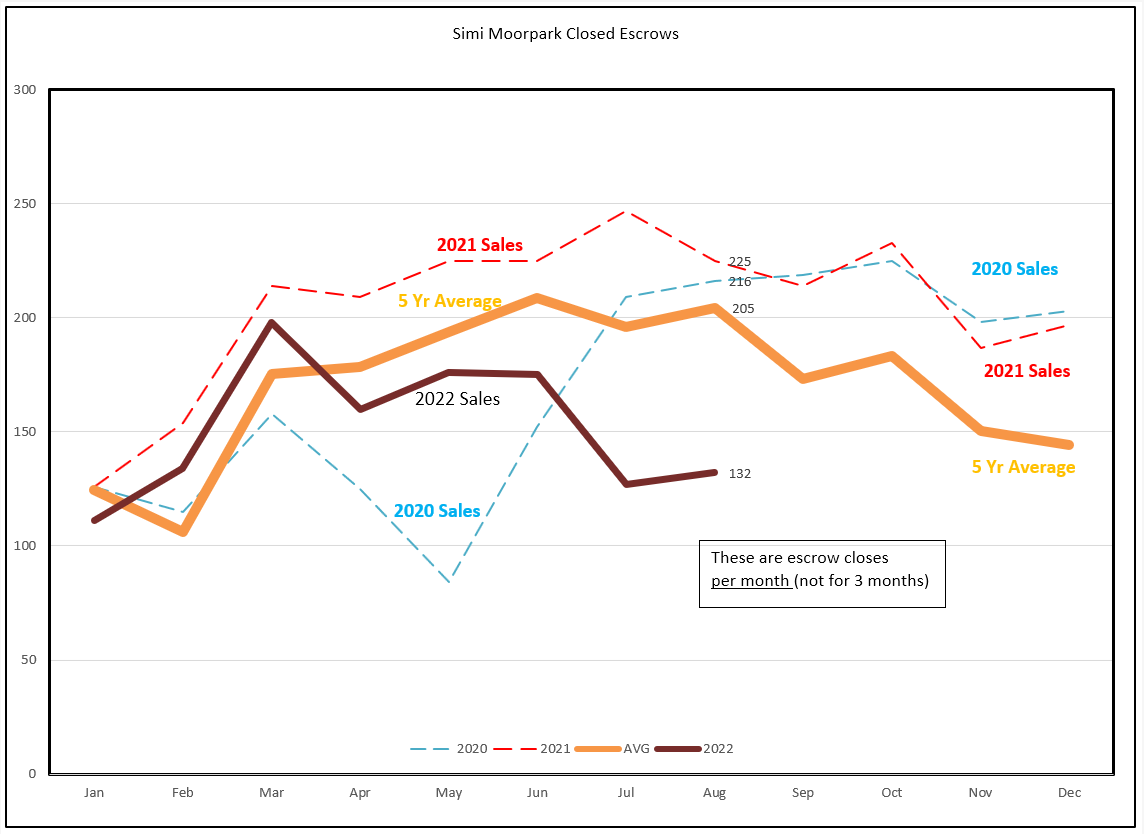
The graph below tracks the same numbers but shows the growth in the total number of sales as the year progresses. For Simi/Moorpark, it is beginning to dip noticeably.
What of the future? Higher inventories, lower sales numbers, and moderating prices.
At least that is what I think.
You sell a lot more houses than I do.
What do you think?
Next month, Jordan and Oscar will make known their projections for next year. We look forward to their professional best guesses.
Chuck