In spite of the concerns about uncertainty, the housing market in our area continues to be strong, like a train. Not runaway locomotive strong, but consistent and constant and moving ahead.
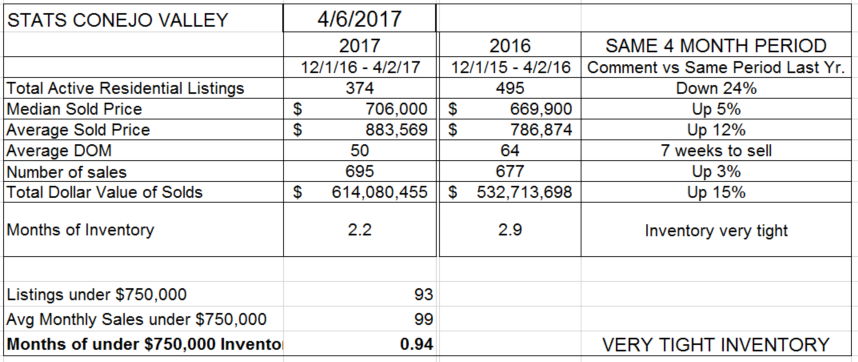
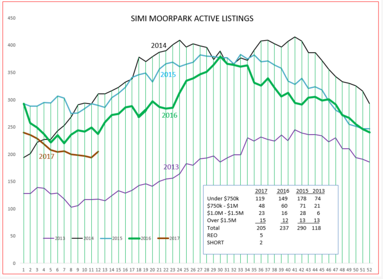
Total inventory is down 24% from last year. The lack of inventory has pushed prices higher, as we shall see in the next graph. The inventory last year represented almost 3 months worth of sales. This year, we have 2.2 months worth of sales, and the inventory of homes priced below $750,000 is less than a month worth. Sales are taking place in 7 weeks, versus 9 weeks last year.
Median prices are up 5%, Average prices up a whopping 12%. The difference is represented by the resurgence of sales in higher priced categories. Appraisers continue to be conservative, and multiple offers are the norm and are proving challenging.
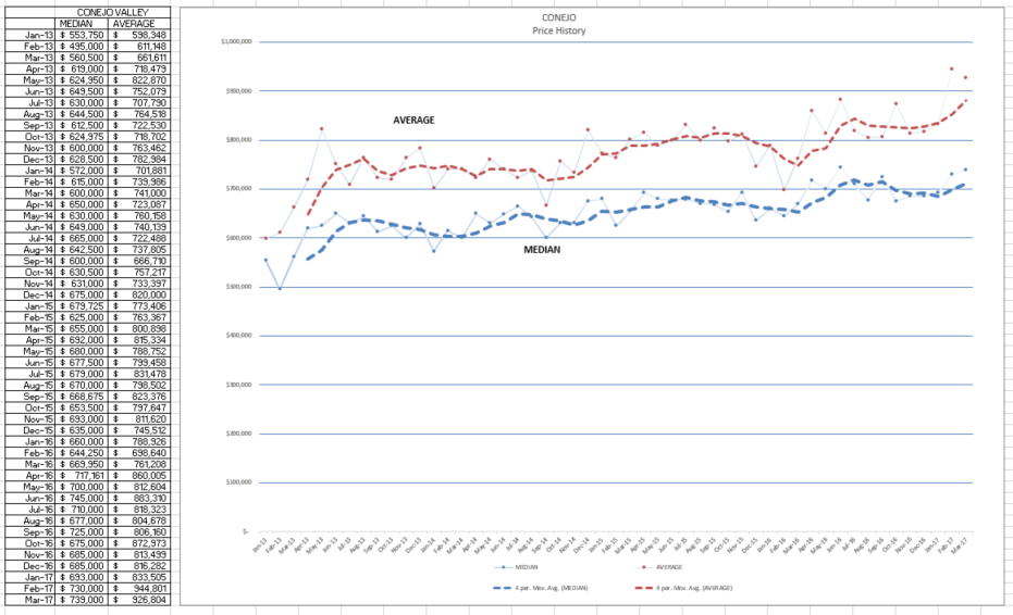
There is a lot of volatility month-to-month in the prices (points on the graph). The dashed lines smooth out that volatility by creating averages of prices over 4 months, and plotting that dashed line. Notice the recent high points in the average prices, reported for February and March were $944,801 and $926,804. In 2013, those numbers were $600,000. Since 2013, over 4 years, prices have increased by 50%. In the statistics page above, median increased 5% while the average jumped 12%. You can see those changes in the dashed lines above.
Median prices have jumped, to around $740,000. In the first STATS chart, the median prices is recorded to be $706,000. That figure is based on the median prices over the four prior months. In the chart above, the median and average prices are for the specific month, not four months. It is another indication of how prices are rising.
Let’s look at what a 24% decrease in inventory looks like, in comparison to past years.
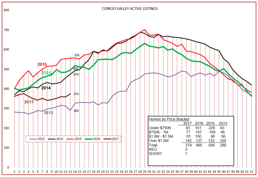
Inventory dipped at the beginning of the year, and we are slowly rising to where we began the year at. I include 2013 figures in the box above because the inventory in 2013 created strong pricing pressure. We are not yet in that territory, but certainly the inventory is causing pricing pressure more than it has for the past four years. Our inventory is 90 more homes higher than 2013, but 45 of those homes are in the over $1.5 million range.
Next let’s compare to what is happening in Simi Valley in Moorpark.
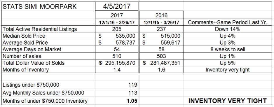
The inventory is down, but by 14%. Prices on this chart show increases of 3-4%. The number of sales is up 1%. These figures represent a four month period.
Let’s see how prices are doing on a month-to-month basis.
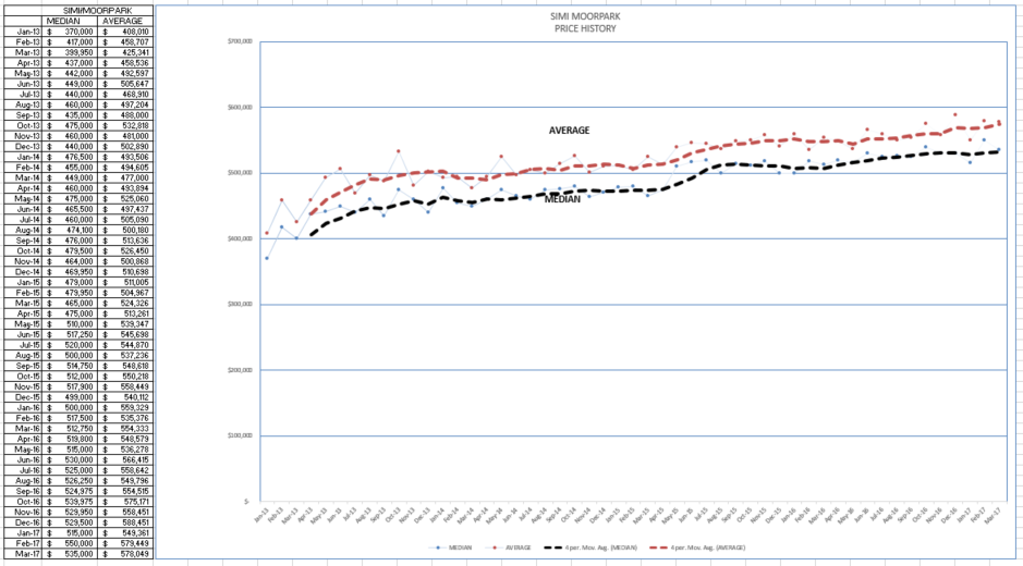
Strong, steady, almost relentless increases. Not as volatile as Conejo, as most homes fall into a narrower range.
Since 2013, prices have gone from $370,000 to $535,000, an increase over four years of 45%, similar to Conejo. Strong, consistent, just like a train.
The inventory remains very tight, only 1.4 months worth of sales and one month for homes priced below $750,000.
As the economists are so fond of saying, there are a lot of uncontrollable factors that could drastically change this outlook. But it certainly seems that things are “on track”.
Chuck