Graphs are like pictures. It can be easier to see something with a picture than describing it with words or figures.
But sometimes the numbers behind the graphs can be inaccurate. They might not tell us exactly what is happening.
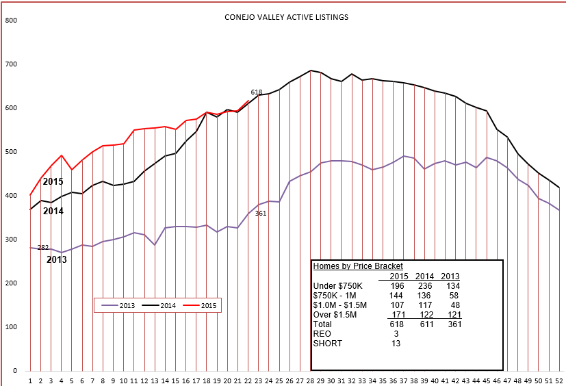
For example, let’s look at the inventory of active listings in the Conejo Valley. The graph below shows inventory growth or decline in the Conejo Valley. It looks as if it is tracking perfectly with last year. But last year was not a great year, this year is much more active. So why are these numbers exactly the same?
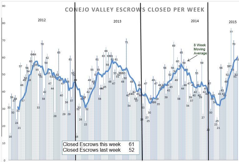
It is because every graph is a picture at a point in time. If someone moves when you are taking a picture, the results are blurred. When I searched the numbers, they seem very close to the year prior. But it does not show activity, just the resulting inventory. When the market is red hot, listings don’t stay listed long enough to become statistical inventory. During the week, Tuesday to Tuesday, they may move in status from active to in-escrow. (I only search for active listings, and do not include contingent sales) One week may be highly active, yet the numbers show that the inventory did not change from week to week, giving you the impression that the market was flat. The inventory graph must be compared to the closed escrow graph.
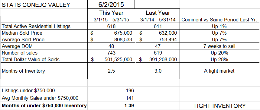
You will notice that activity measured by closed escrows has been highly active. When the inventory graphs stays static, it leads us to believe that the same number of homes went into escrow as came new onto the market. It’s like the score of a ball game. You don’t know who won if the report says Dodgers 6. You also need to know what the other side did. In the above two graphs, although the inventory looks the same as last year, sales were higher. Let’s compare the real numbers.
Inventory, up slightly.
Number of sales, up 20%.
Sale price, up 7% from the same period last year.
Months of inventory has decreased, from 3.0 months to 2.5 months, and for homes priced below $750,000, only 6 weeks worth of sales. Months of inventory is an important figure, as it compares the size of the inventory to the average length of time it would take to sell the entire inventory if nothing new came on the market.
The inventory is tightening. The inventory number is the same as last year, but the inventory as compared to current sales shows that the market is tight, and that leads to price increases (the famous supply-demand theory. )
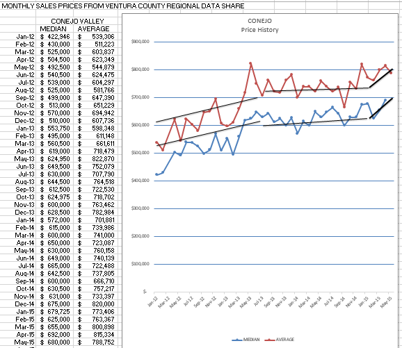
So have prices been rising? Check out the graph below.
The graph above shows that price increases have been very strong for the first few months of the year. it is a graphical presentation that shows very strong increases, stronger than the 7% comparison number from a year ago.
You need to understand the dynamics of the market, what is happening, rather than what happened a year ago. It helps you give advice to your clients.
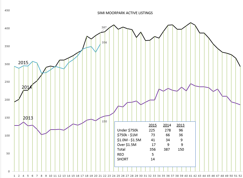
Simi Valley/Moorpark inventory paints a different picture.
The inventory graph in Simi/Moorpark has not been behaving like last year.
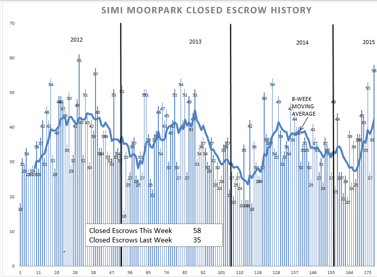
The inventory is lower, compared to Conejo, and compared to last year. What about closed escrows?
Closed Escrows did take the usual dip at the beginning of the year, but have come on very strong, with some very big weeks. Looking at the actual numbers,
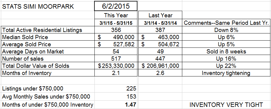 Inventory down 8% from a year ago, prices up 6%, the number of sales up 16% from last year.
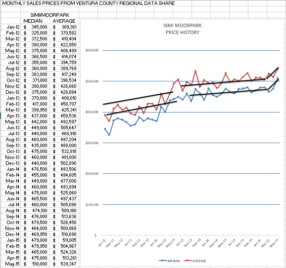
But look at the inventory figures. About 2 months worth of sales, and for under $750,000 only 6 weeks of sales. A tight inventory, with the number of closed escrows up 16%. What has that done to prices?
Similar to Conejo, prices are strong, prices are increasing, inventory is not increasing. Supply and Demand are not balanced, and that affects the third part of the law, price. If you want to sell more things, lower the price. Demand will increase, and supply will decrease. These three work in concert. We have a stable supply (and, thank goodness, an ample supply) and strong demand. The strong demand is pushing the inventory lower, and that in turn is pushing prices higher.
It’s a good time to be in Real Esate.
Have a prosperous week.
Chuck
