Economists seem to all agree that things are going well.
Economists seem to all agree that there are many scary unknowns to consider that could turn things bad.
Let me stick to the things going well, and let someone else worry about the unknowns.
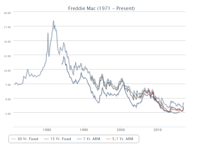
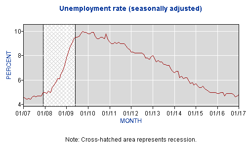
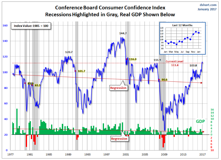
Real Estate in our valleys enjoyed another good year. We are experiencing minimal foreclosures and short sales. Consumer confidence is high, interest rates and unemployment are low, inflation is proceeding at a reasonable pace.
One of the factors contributing to inflation (some inflation is good, runaway inflation and deflation are bad) is the housing market. Looking at the past will give us a window into the future.
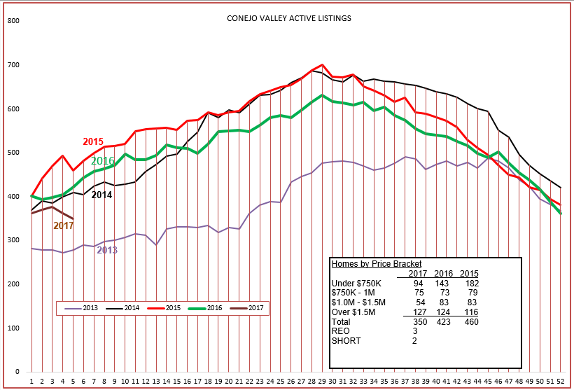
First, let’s look at the inventory as compared to the past few years.
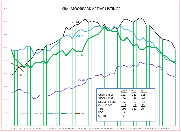
We began the year in roughly the initial point as the last few years, but the inventory has taken a sudden downturn. Particularly note the inset box, showing inventory of under-$750,000 homes at only half of the 2015 inventory. Some of this can be attributed to average prices increasing over the years and less inventory at the lower price level. However, all levels except the highest show very low inventory. How about Simi Valley and Moorpark?
Exactly the same situation, inventory dropping precipitously. In both charts, the inventory remains above the very low inventories experienced in 2013 which resulted in substantial price increases.
Most of the forecasters look at an annual price appreciation of 6% this year. But remember, that is the average over a wide area. All real estate is local. And our local supply and demand ratio indicates strong appreciation due to lack of inventory.
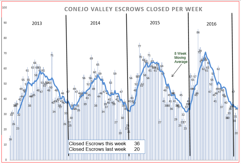
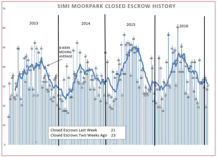
Demand continues at what I will call a normal pace. Because the inventory is so low, particularly in highly desirable price levels, we feel that sales could increase if we had more to sell.
Both valleys are following the same pattern.
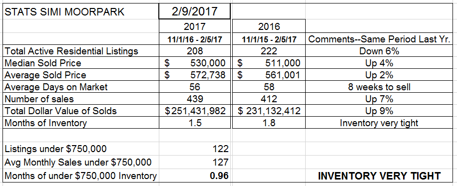
Let’s look at the current statistics to see numerically what is happening.
The first graph showed inventory dropping, and this table measures the inventory as dropping 17% from the same week last year.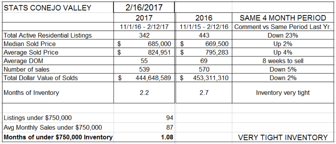
It also shows pricing up between 2-4%, and the number of sales declining 5% compared to the same three months last year.
The “months of inventory” figure is dependent both on the inventory and the rate at which that inventory is sold. Even though sales are down 5%, the inventory is down 17%. Therefore the months of inventory number is declining, only a little over 2 months worth of homes available to sell at this rate. The number is much higher for the inventory priced lower than $750,000, only about one month’s worth.
For Simi Valley and Moorpark, the inventory is down 6% versus last year, but last year their inventory began the year very low and continued that way throughout the year. The number of sales was up 7%, depleting the lower inventory even quicker than last year, and the entire inventory represents only 1-1/2 months worth of inventory. The under-$750,000 inventory is the same as in Conejo, only about one month worth of sales.
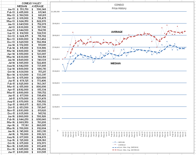
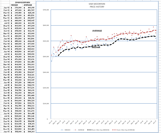
Looking at prices, the chart below displays how prices have changed, and also shows some seasonality as the summer months with higher activity usually mean higher prices, while the reduced inventory in the winter months tend to drive the figures down a little. Month to month, the figures can vary greatly, so the dashed-lines represent an averaging of the numbers over the immediate 8 previous weeks, making the direction easier to see. The difference between the two lines represents the preponderance of higher priced homes. More homes in the higher prices will increase the distance from the median line, whereas fewer higher priced homes will draw the average line closer to the median, for you chart geeks out there. Most would rather scan down the list of prices on the left.
Lacking the confusion caused by different price levels, the Simi/Moorpark chart more accurately depicts the price increases over the past four years, as the majority of their sales are below the $750,000 price level.
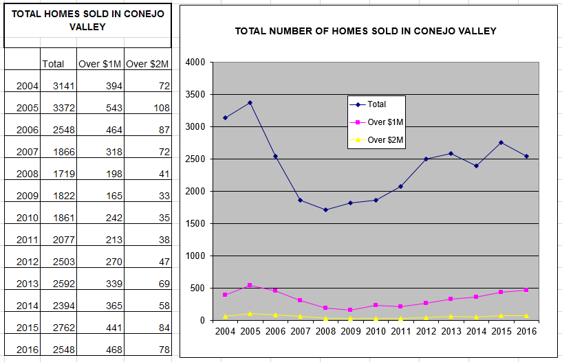
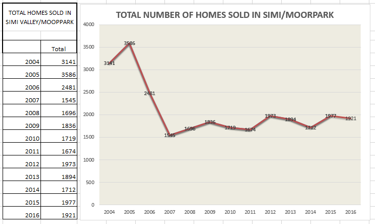
At the end of the year, it is useful to look at some long term trend charts. These charts display the number of annual escrows closed, closed sales.
Over the years, starting in 2008, both valleys have seen the number of homes sold each year grow positively. It is always interesting to look back at the period 2004-2007 to see just how big a “bubble” we had in sales, and the corresponding drop due to the mortgage crisis. Slow, steady growth, both in sales and in prices, contributes to the investment stability of owning real estate. With 30 year fixed rate mortgages at reasonable rates, who would want to pay rent that increases every year when you could lock in most of your housing costs for the next 30 years?
Good homes in good valleys, great places to live. If only I could show that on a chart.
Have a wonderful year.
Chuck
