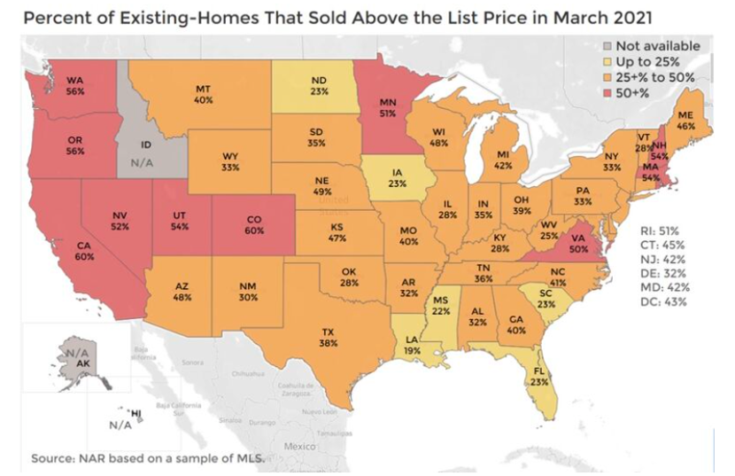
WIth a combination of restrictive inventory, multiple offers, and low mortgage rates, prices continue to escalate. Homes are being listed at aggressive prices, and they are selling for higher than those prices across the country. In California, 60% of homes sold above list price in March (NAR graphic). Just when we think we are listing at too high a price, multiple offers arrive to change that thinking.
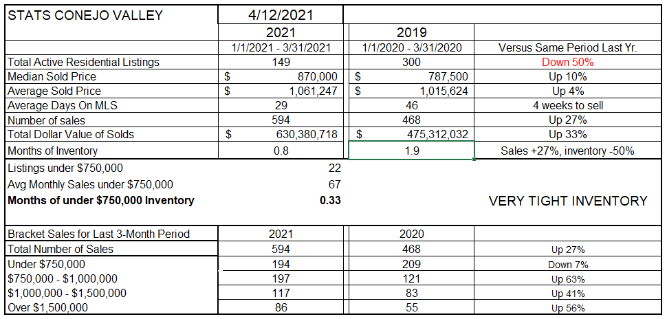
As seen below, our inventory is down, only half the inventory available at the end of March last year. The Median sold price is up 10%. Homes are on the market an average of 29 days, only four weeks. If no new inventory was added, at the current rate of sales the entire inventory would be sold in less than a month. The lack of inventory is responsible for prices rising strongly, just as the lack of inventory is responsible for restricting the number of homes being sold. Even so, the total number of homes sold in the first three months of 2021 is 27% higher than the same period last year. Go figure.
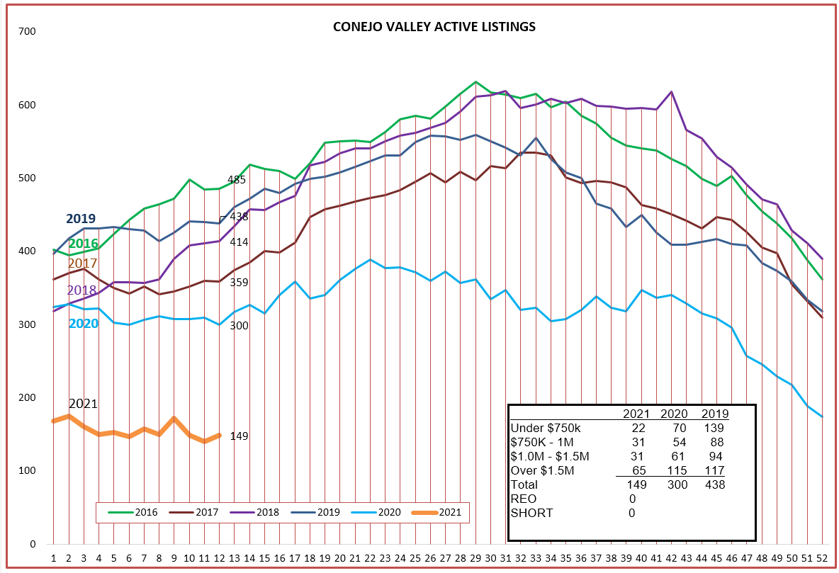
The number of sales is up strongly in all brackets except for homes priced below $750,000. Why? Because Conejo doesn’t have many homes to sell that are priced below $750,000. Only 22 homes out of a very low total inventory of 149. Over three months, 194 of that category of homes sold, or about 15 a week. The total number of homes sold in that category is down 7% compared to last year, while all other price categories sold significantly more homes. Some sales have moved to the next price category because median prices have climbed significantly, up 10% The 2021 inventory line in the chart below does not even look as if it belongs on the same chart as other years. The combination of low inventory (down 50%) with strong demand (up 27%) is causing prices to drastically increase (median up 10%).
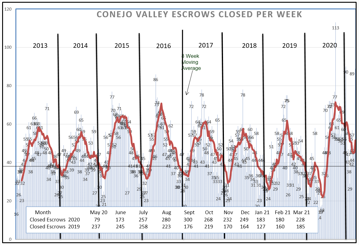
Let’s look at the closed escrow chart next. A dip in sales usually occurs in the first two months of the year, due to the end-of-year holidays. Homes re-enter inventory in January and sales usually occur 45-60 days later. In the chart below, sales normally bottom out at around 35 per week, and then increase. For 2020, there was a double-dip due to COVID, down to 25 per week. This year, the low was only 47 and the increase in sales was substantial after that dip. Monthly sales figures have exceeded previous year numbers since August of last year (see box within chart).
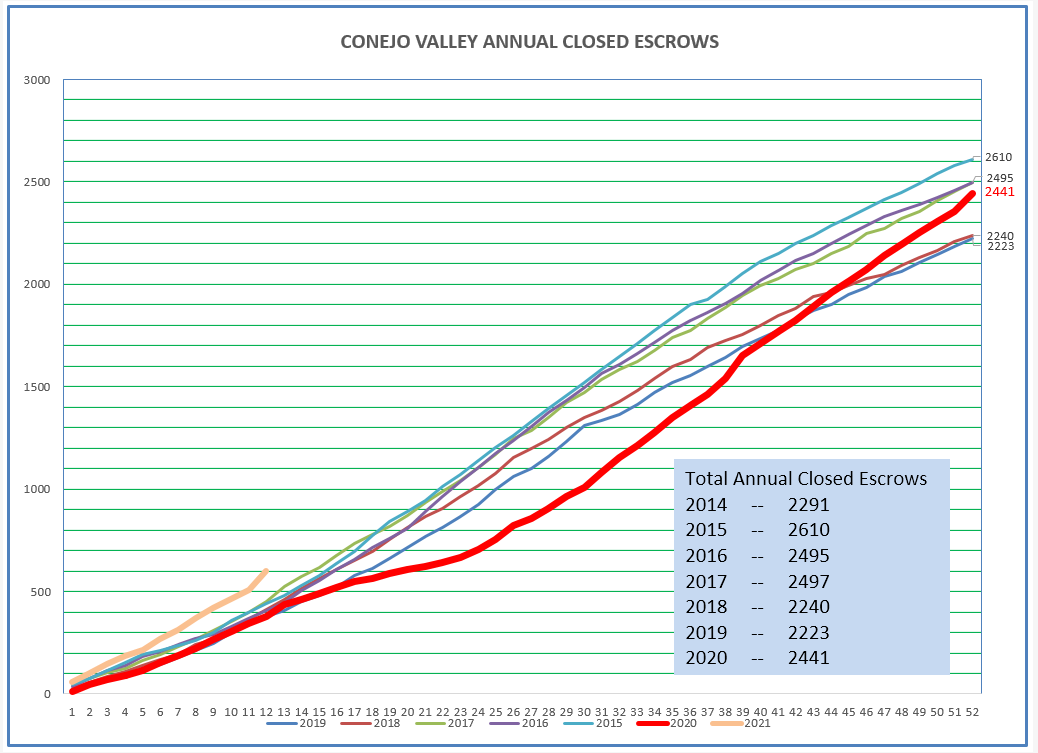
Let’s look at those sales figures a different way. The chart below displays the total number of sales as the year progresses. The 2021 figure, in tan color, shows this year is starting out stronger than any of the eight years displayed. The red line describes what happened in 2020. The year began on track with others, dipped precipitously as COVID hit in March, and then regained strength to finish closer to the record annual sales years, much stronger than anyone anticipated.
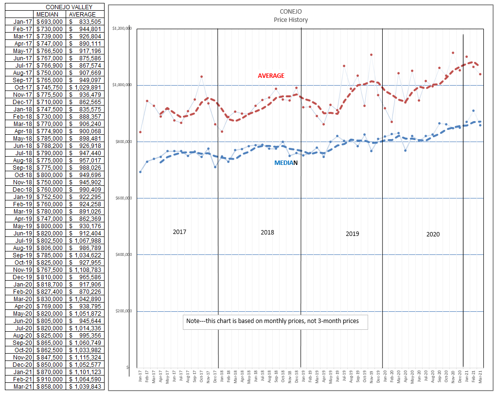
Finally, what does the price chart look like? These prices are individual monthly prices, not three-month averages. The dashed lines represent a four month rolling average, smoothing out the chart. Median prices continue to increase strongly. The Median price is the price at which half of the homes sold for less and half sold for more. The average price is the total of all the prices divided by the number of sales. The Median gives a more reliable number.
Prices and salesnumbers are very strong, and according to reports I am hearing, both should continue to rise in the coming months.
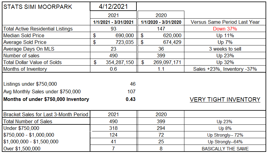
Let’s look at Simi Valley/Moorpark to see if we are getting the same story. This market has an average priced lower than Conejo,with a Median price of $690,000 versus Conejo’s $870,000. That $200,000 difference will attract more first time buyers due to affordability and lower down payment requirements.
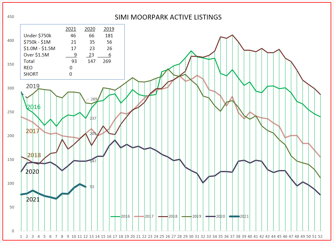
The available inventory chart is below. 2021 is almost off the chart. With less than 100 homes available for sale, shortage of inventory has consistently resulted in multiple offer situations and prices rising strongly, with the median up 11% year over year.
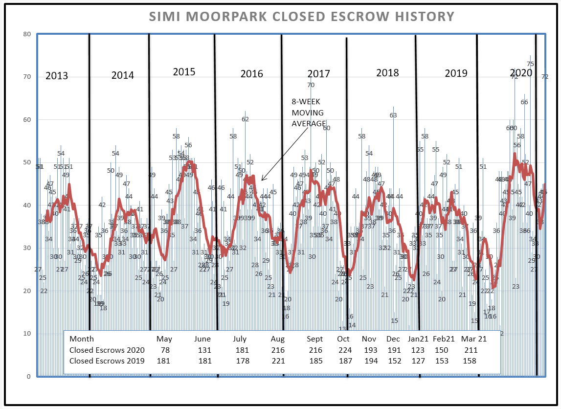
Even though inventory has been scarce, sales have continued to remain strong, 23% higher than last year. Look at the chart below to see how strong sales have been in the last half of 2020. The beginning-of-the-year dip usually drops to around 25 homes a week. This year it was 36, 10 homes per week higher. If inventory were only available, sales numbers would be even higher. We are already selling at what for most years would be a summer peak. I am running out of adjectives to characterize the strength of the market.
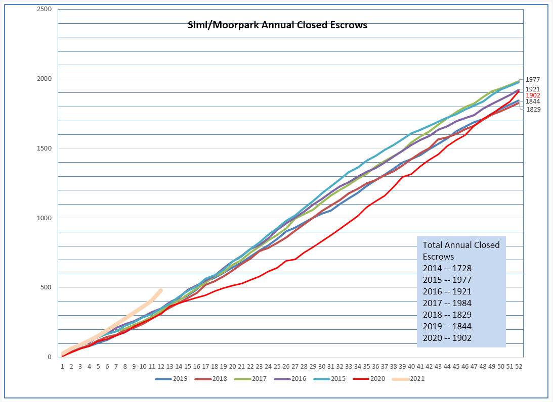
Looking at the cumulative sales chart shows this strength in a different way. The red line showed the impact of COVID , yet the market finished the year quite strong. The tan line below gives you a visual picture of just how strong the market is starting out this year.
FInally, the pricing chart. Remember, these numbers are for individual months, not three month averages. The strength can be seen by comparing the median prices as very consistent from the last half of 2019 through the first half of 2020 ($600,000) with the current median price of $700.000. An increase of $100,000 over 12 months. Compared with any other asset over the COVID period, a fabulous return. 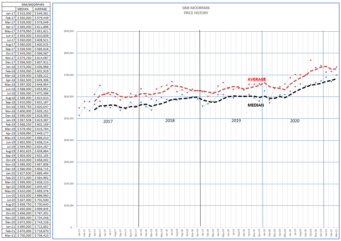
This is now past history. April reports do not forecast any change in the market. With strong stimulus from the government, the increasing percentage of the population now protected by vaccines, strong buying pressure from the Millenials, and the lack of concern from the FED that plans on keeping rates low, I don’t see any changes in how this market is reacting for the next few months.
Chuck
