An old saying is that “A picture is worth 1,000 words”. That said, I am going to start this blog out by “quoting” pictures (charts) from some very good economists that are much better artists than I am, particularly Dr. Mark Schniepp, Director of the California Economic Forecast in Santa Barbara, and Jordan Levine, CAR Senior Vice President and Chief Economist.
First, more verification that homes are a good long-term investment. They certainly are in California. Those $200,000 homes purchased in 2000 are now worth over $800,000. This chart also verifies that housing is truly a market, prices can go up and they can go down.
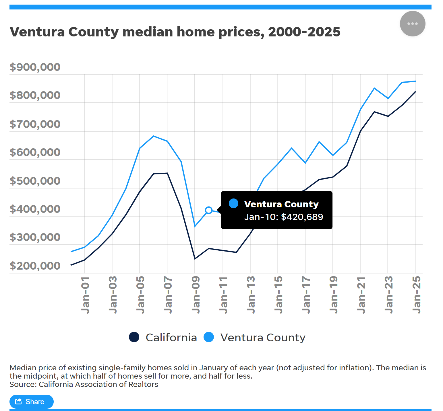
The California housing market was HOT most of this century, but markets can move both up and down, and the “Great Recession of 2008” was proof of that fact. The same result was expected when COVID hit. Everyone expected the housing market to tank when all commerce came to a screeching halt. Just the opposite happened,. COVID produced a couple years of excellent demand and rising prices as people worked from home, no longer concerned with long driving times to get to the office.
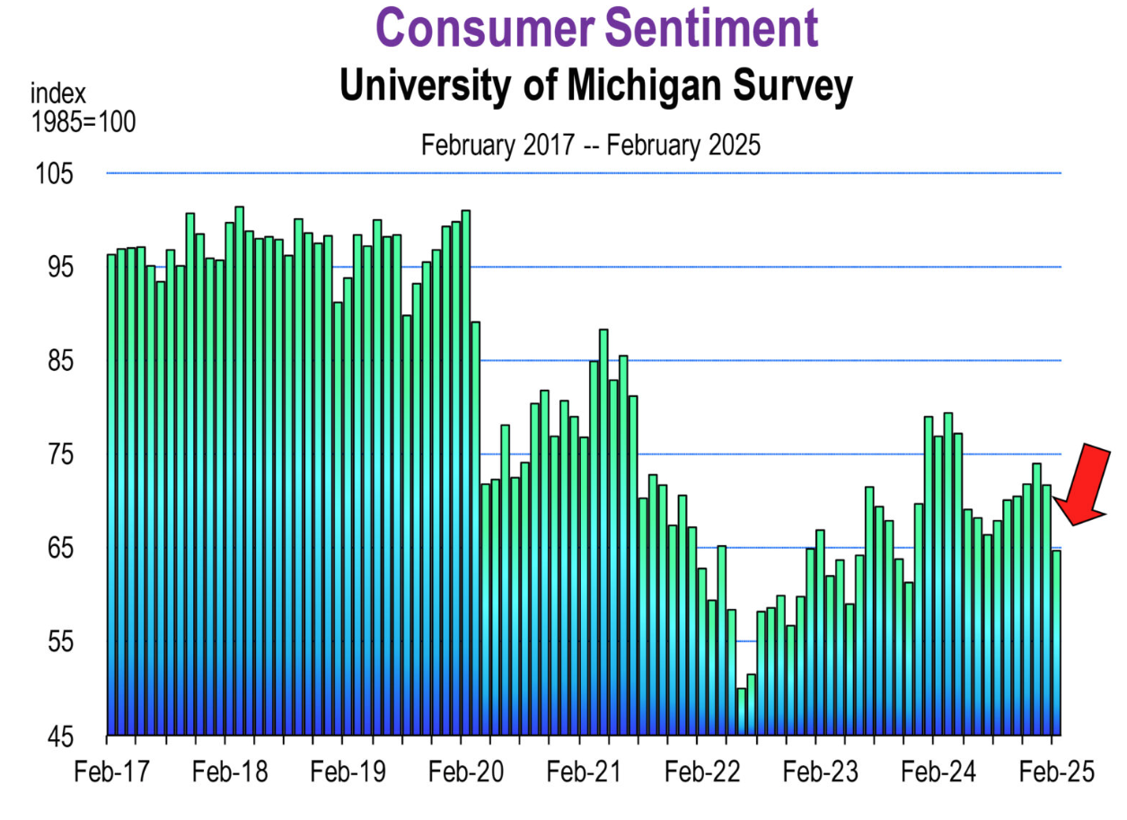
How consumers feel about the economy is perhaps the major factor driving the economy, and we need to pay attention to consumer sentiment about the future, including their desire to make a long term commitment to housing. At this time, due to the changes coming out of Washington, consumers are uneasy. Read the recent analysis from Dr. Schniepp, including the chart below.
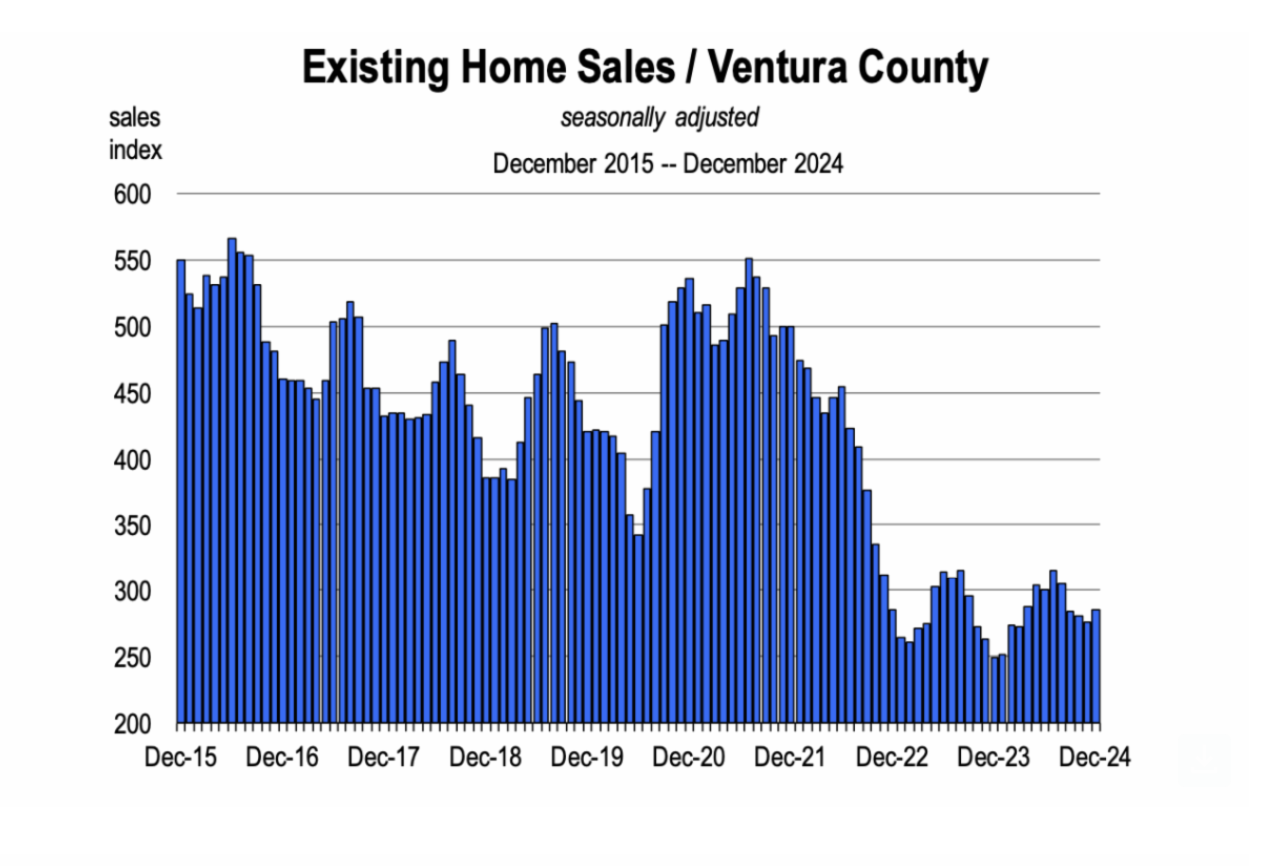
There are many reasons why the number of housing sales have been lower for the past two years. One is interest rates. After the Great Recession, homeowners largely refinanced their variable rate mortgages to fixed rate mortgages, often at rates at or below 3%. Mortgage rates are currently around 7%. Joel Singer, recent CEO of California Association of Realtors, previously explained that while homeowners may consider moving from to another home, they will hesitate because they are hesitant to give up their low mortgage rate. Home sales have been anemic for two years as mortgage rates spiked.
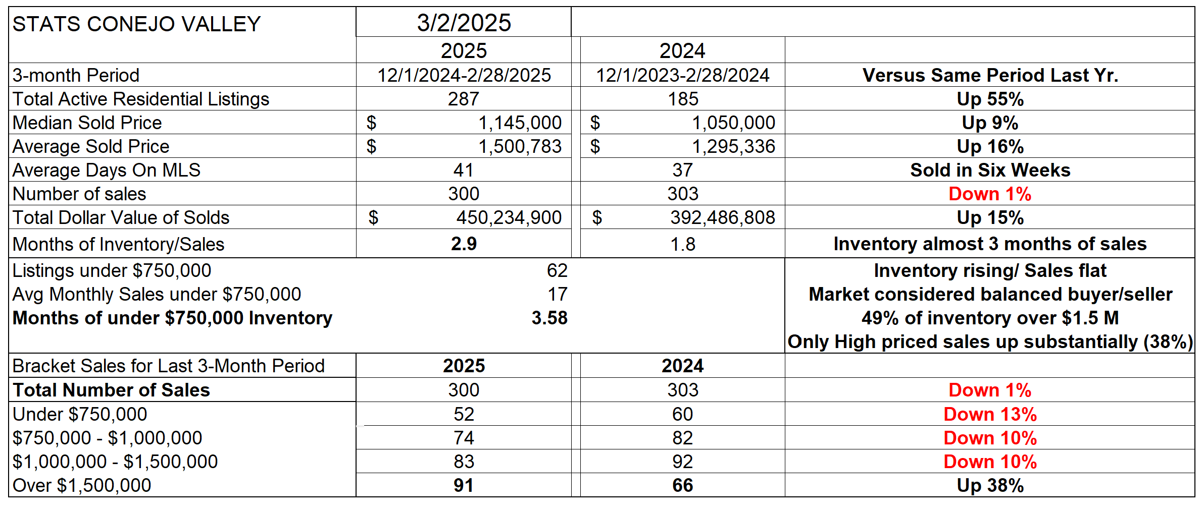
How is the market starting out for 2025? Let’s begin with the overall statistics table. This table represents three months worth of recent information, compared to those same three months a year ago. Inventory has been rising, and is now 55% higher than it was a year ago. A shortage of inventory usually causes home prices to rise. But with sales numbers still comparable to last year, and inventory significantly higher, the amount of time to sell all our current inventory based on the current level of sales is now just under three months. That number identifies with a balanced market, one favoring neither buyer or seller. Balanced markets do not usually precipitate large price increases. However, prices rose dramatically compared to a year ago, with Median prices up 9% and Average prices up 16%. The difference in these two measures can be attributed to the strong impact of our highest priced homes, those in excess of $1.5 million. Almost half of the active inventory of homes is priced above that $1.5 million figure.
Look at the bottom of this table, and you will see that the only price category of homes with increased sales from last year are those above $1.5 million. All other categories are lower in sales numbers. This highest price category of homes is also less affected by mortgage rates, as those owners are more able to buy either for all cash or get short-term financing at a lower rate, and then refinance in the future or pay off their mortgages. Not all, but most high-priced home buyers fall into this category. Except for the highest priced homes, sales remain dismal compared to last year.
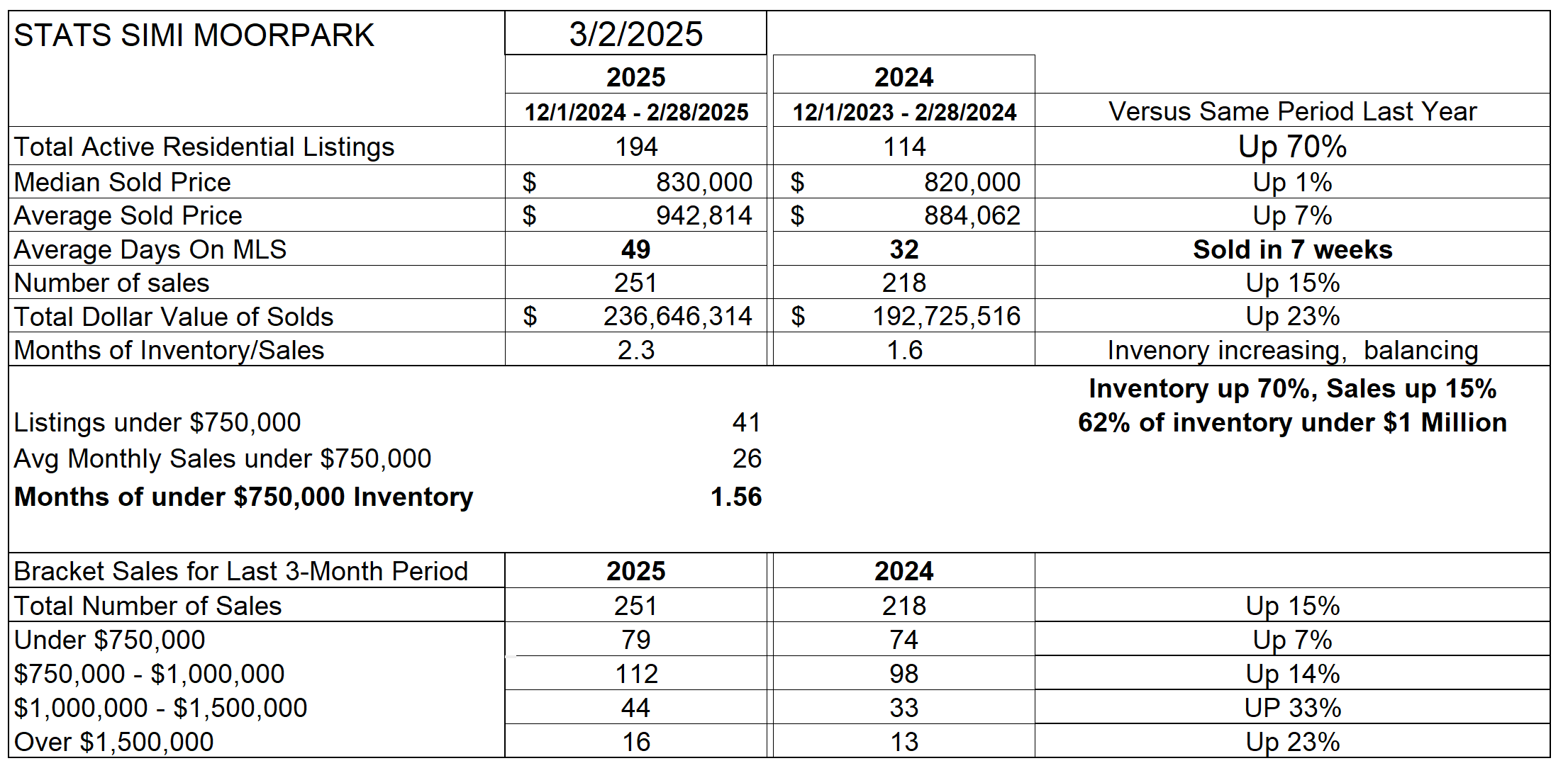
Unlike Conejo, SImi Valley and Moorpark lack a large number of highest priced home sales, and their market is behaving differently. Inventory availability has been a problem for the past few years, but has now turned around. Inventory is up 70% compared to last year. Median Prices are up 1%, while Average Prices are up 7%. Sales that took place in four weeks last year are now taking seven weeks. Due to increased inventory availability, the number of sales increased dramatically, up 15%. Look at the bottom of the table to see that every category of homes increased in sales. The Months Worth Of Inventory has risen from 1.6 months to 2.3 months worth, approaching a balanced market where neither buyer nor seller have an advantage.
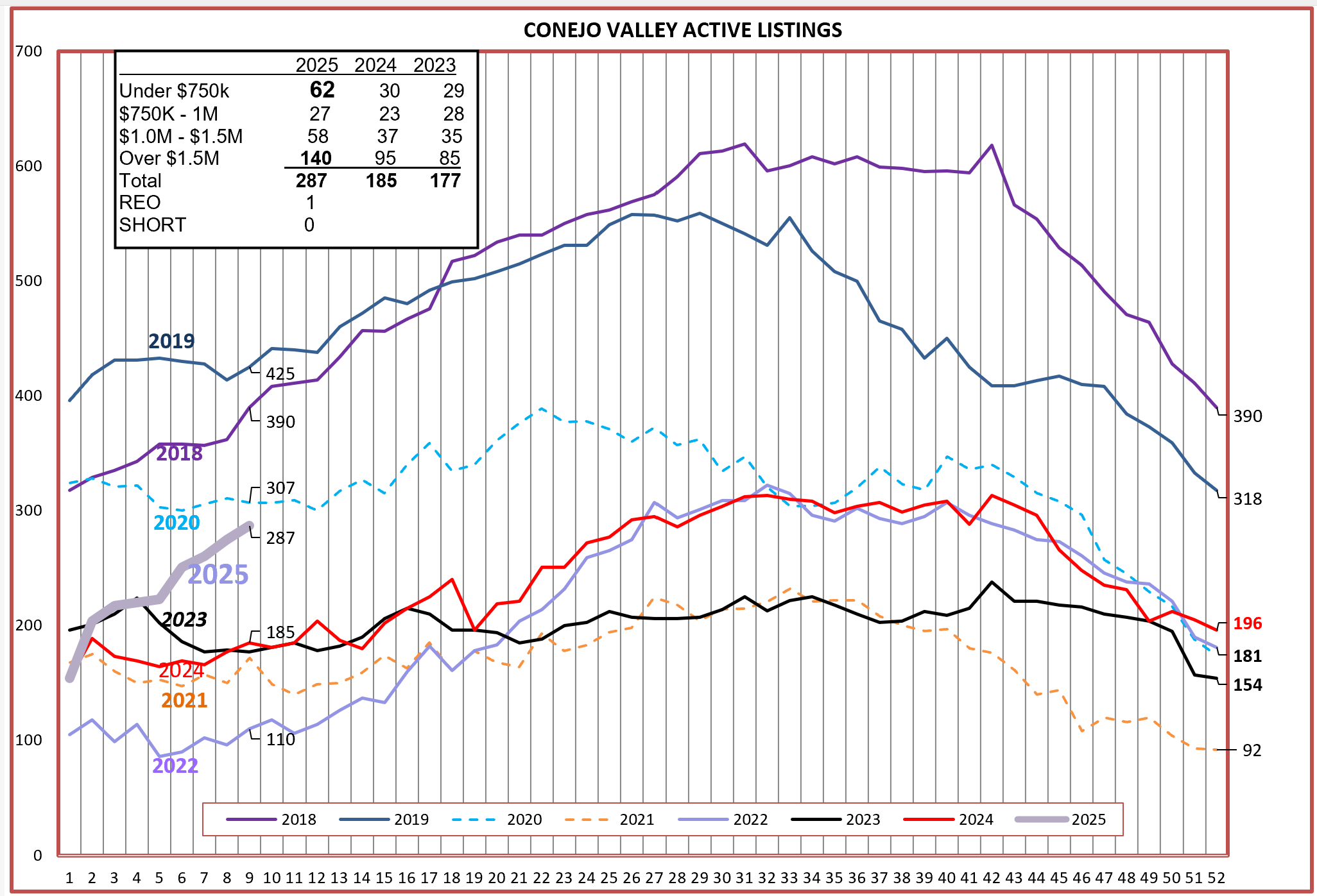
Let’s break down some of these figures a little further. Inventory is climbing steadily, see the dark gray line below. Inventory growth is tracking similar to the pre-Covid years, but at a lower level than 2018-2019, but much stronger than the other years see in the chart. Conejo inventory experienced a large bump in the Under-$750,000 category, with new listings spread across the region. The highest price inventory category represents almost 50% of the total inventory of active listings.
For Simi Valley/Moorpark, inventory is currently the second highest number since 2018. From the inset box, you can see that all price categories have solid increases. Inventory has been a problem for years, but not so this year. 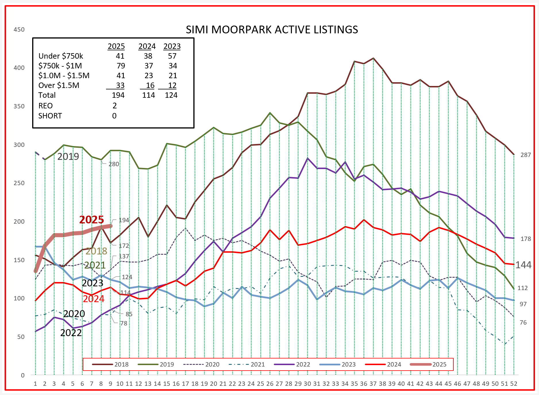
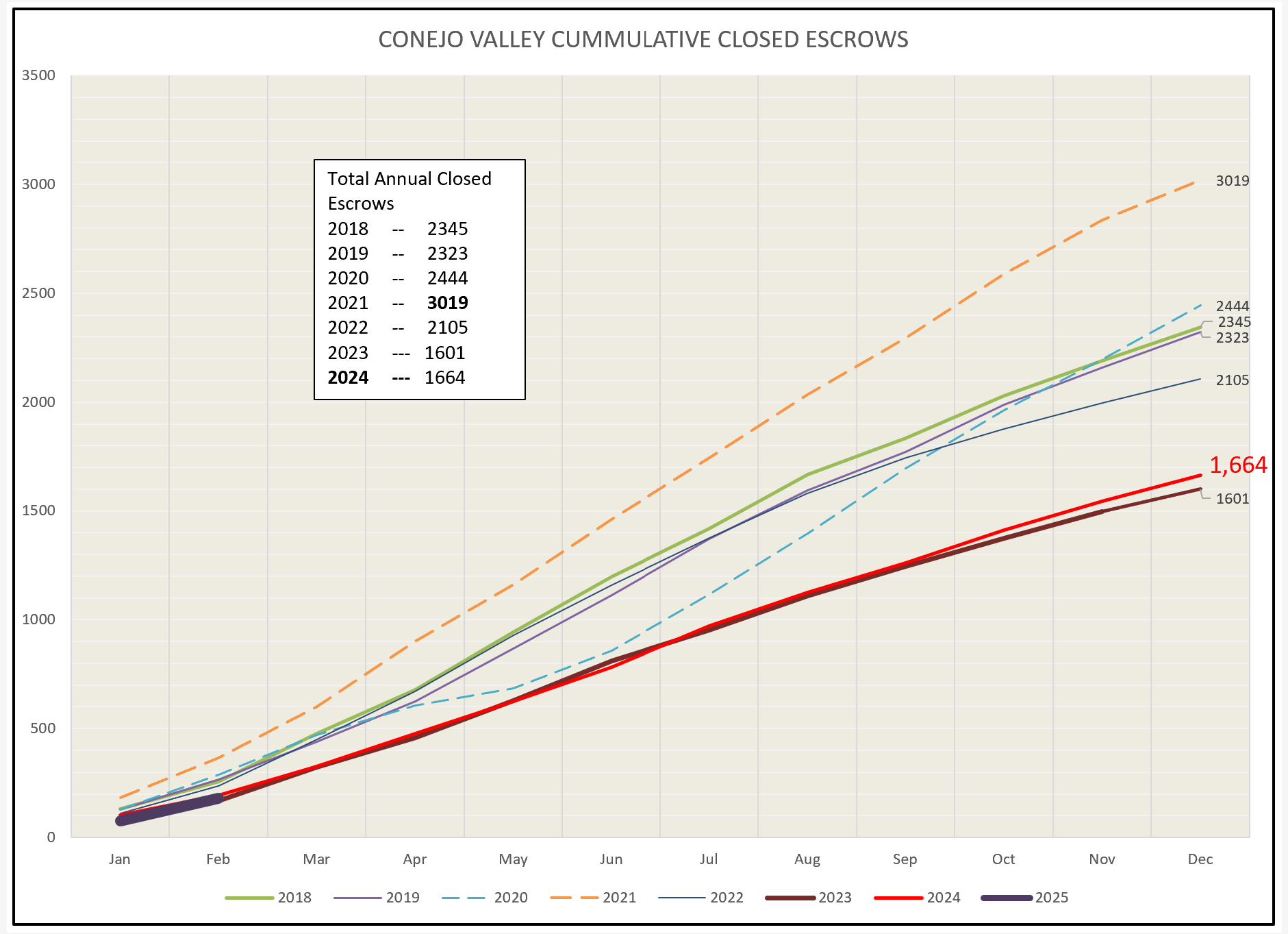
Sales in Conejo remain low, andparticularly lower than the 4-year average of 2016-2019. We appear to be on the same path to achieve sales numbers similar to the last two years, but it is too early to tell.
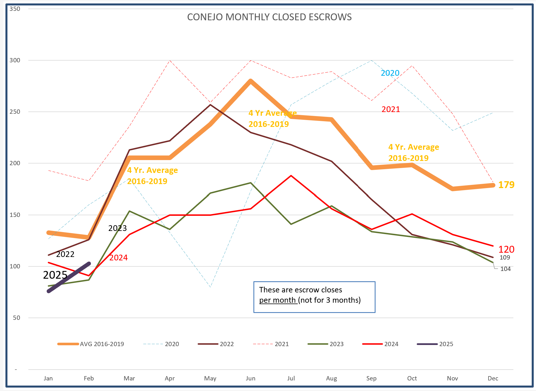
The solid black bar in the bottom left shows a little better how 2025 is starting out, again similar to 2023 and 2024.
For Simi Valley/Moorpark, sales are (what’s another word for anemic?) SInce we only have two months of sales to determine trends, it is too early to say how 2025 will proceed. However, given the uncertainty explained in the beginning of this blog, I cannot find any reason why 2025 should turn out any better than the past two years.
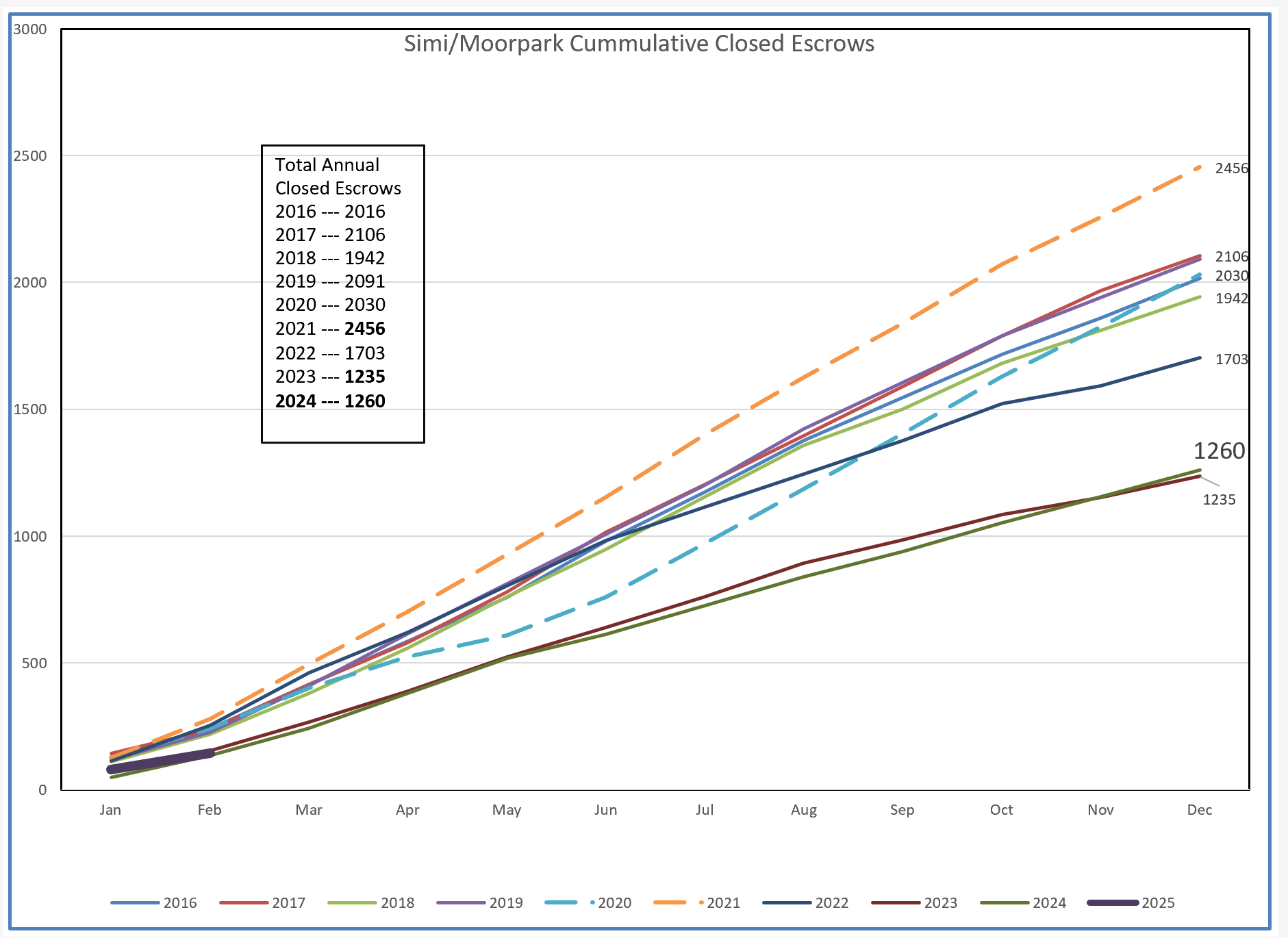
The chart below is for Simi/Moorpark, and shows that even though the inventory is available, sales have began the year very weak. However, the table at the beginning of this blog that compares the past three months with the same period last year was positive by 15%. 2024 finished strong with 106 sales in December, so that influenced the table more than the chart below. Time will have to tell us as this year continues.
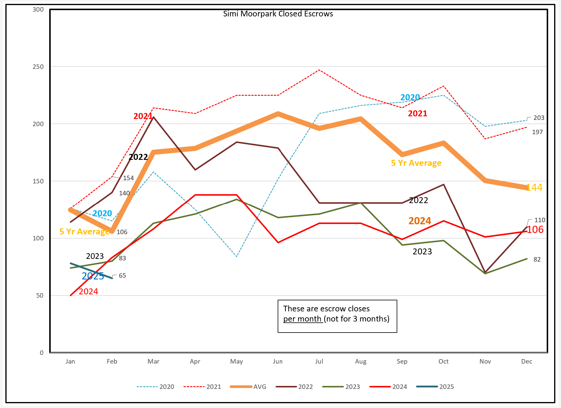
We again see this year mirroring the past two years, certainly not indicating that this year will be any different. Of course lots could happen, and politics certainly will be a major factor.
What can we say about prices, and how they are trending, given the above information? We are dealing with a market with both Median and Average prices well above $1,000,000. Another favorite economist, Dr. Matthew Fineup of CLU, spoke a great deal recently about Ventura County being one of the least affordable housing markets in the entire country, when comparing the price of housing versus income levels of county residents. Many of our residents enjoy living in very expensive homes due their purchase of those homes 20-30 years ago, and would not be able to afford to live in our area based on their current incomes. We are in large part a bedroom community with homeowners driving towards downtown LA, and needing two incomes for a couple to afford a median priced home. We also have good jobs in our area, but many of those job holders cannot afford to live where they work. As proof, try going south on the 101 around 4:30 pm and experience the bumper to bumper traffic leaving our area.
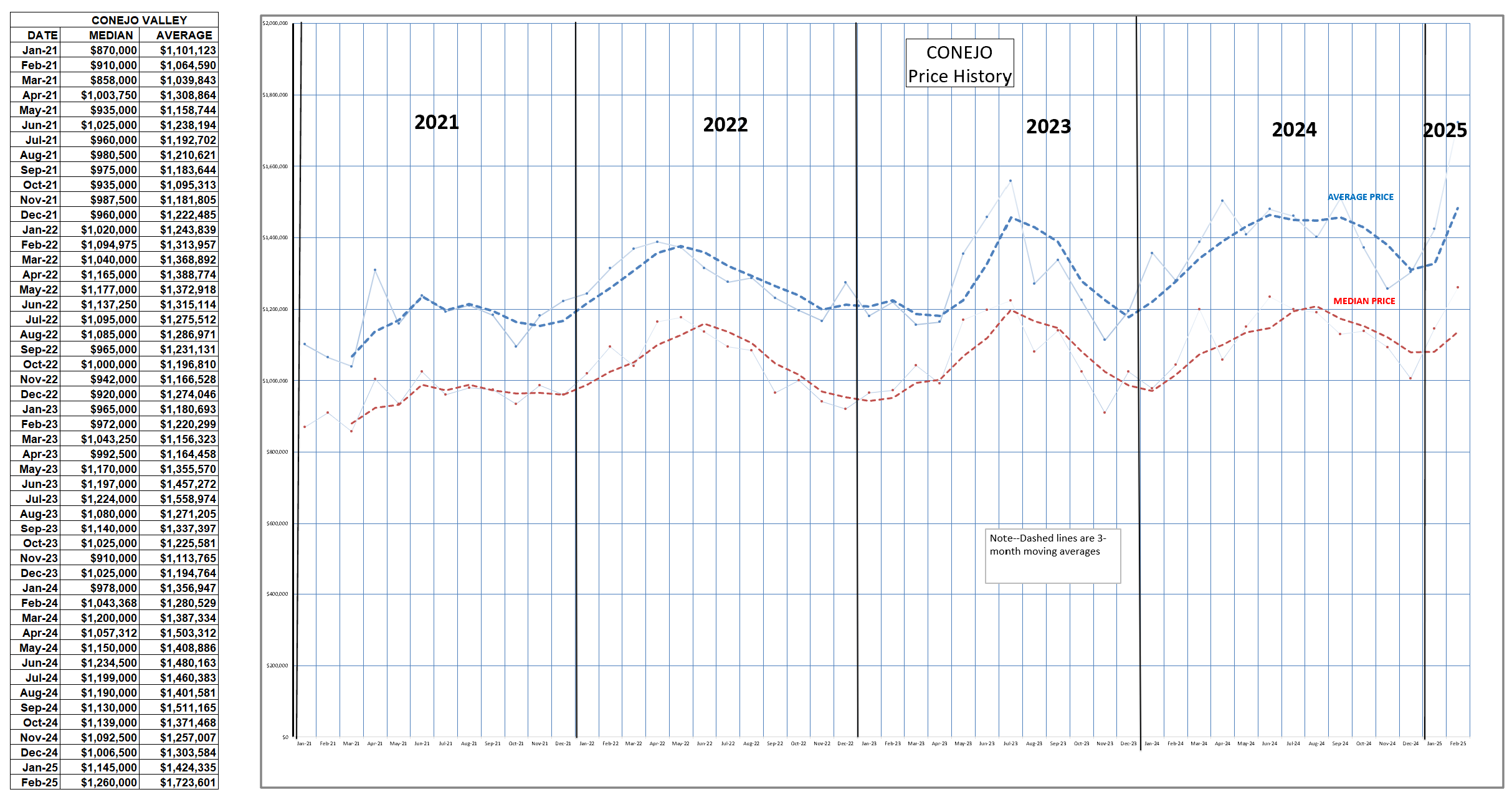
This chart displays the changes in pricing for Conejo as the year progresses. We previously looked at this chart as a mirror of inventory or sales, but now it also seems to reflect pricing as the seasons progress.
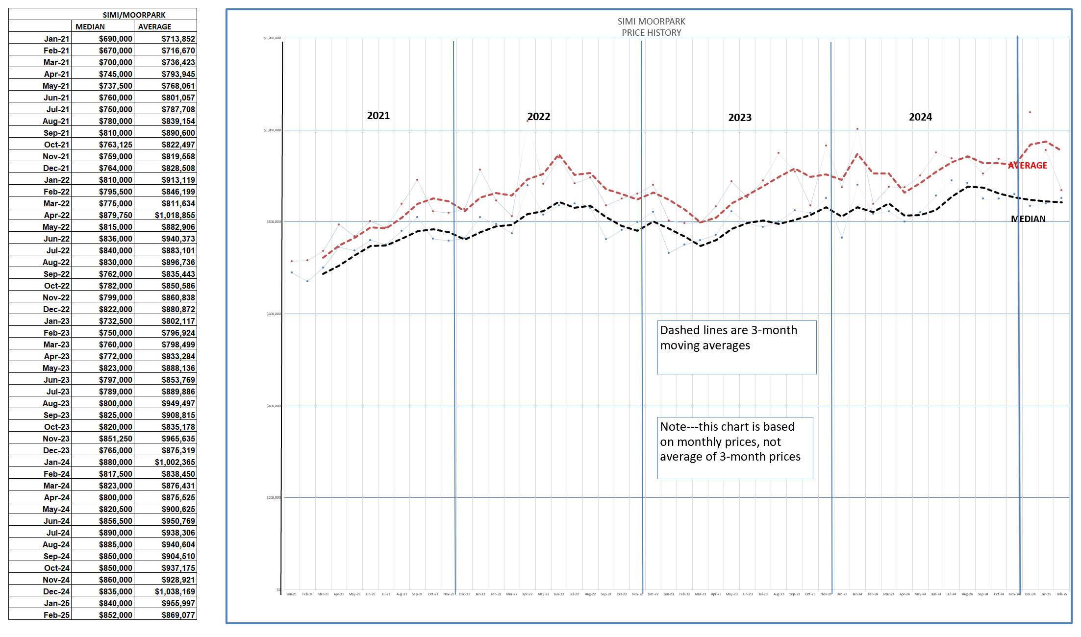
For Simi Valley/Moorpark, prices have not followed the seasonal pattern above. However, the space between the Median and Average lines has grown a little as more expensive housing in this area has become a more significant factor.
What of the future? At best, I see stability, with prices trending a little weaker than they have been. Sales volume looks to be similar to the past two years. Pricing is stabilizing or potentially decreasing as more inventory, more choices, and longer times on market take the air out of the price balloon we have been dealing with. Unless we see major changes regarding mortgage rates, I cannot see why prices and sales volume should increase in 2025. Another big factor is consumer confidence. With questions about inflation and interest rates, and the leading indicator stock market suggesting a dismal economy, consumer confidence is tanking, and that means buyers will not be optimistic about the future, including buying homes with 30-year mortgages.
That’s what I think. Please tell me what you think. chuck.lech@gmail.com
Stay safe and healthy out there.
Chuck